

Great sales pages don’t shout; they clarify. The best ones guide a reader from “Is this for me?” to “I know what I’ll be able to do after this” and make the next click obvious. Think of the page as a conversation with a single, focused purpose: remove doubt and help the right buyer start today.
Begin with a promise-driven headline that states the outcome in plain language. If a visitor reads nothing else, they should still understand what they’ll be able to do and roughly how quickly they’ll get there. Follow with a short subhead that adds context—who the course is for and why now is the right time—and a clear call to action that appears above the fold so the motivated buyer doesn’t have to hunt.
Help them see success, then show them where to start.
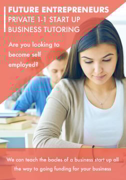
Next, make fit unmistakable. Describe the learner you designed this for, the problems they’ve already tried to solve, and the moment in their journey where your course makes the difference. When readers recognize themselves, they lean in; when they don’t, they self-select out, which saves everyone time and increases your conversion rate.
Lay out the syllabus at a glance. Instead of a vague list, show the actual modules and the specific capabilities each one builds. Keep copy tight and concrete—what will they do, make, or decide after each section? This anchors value in outcomes rather than runtime and lets buyers imagine progress before they purchase.
Modal Pop-Ups
Prove it with evidence that feels human. Share a short story, a before-and-after, or a result that ties directly to the promise in your headline. If you’re early and don’t have testimonials yet, use your own track record or a quick case from your work. Two or three strong signals beat a wall of generic praise.
Handle objections where they happen. A good FAQ anticipates the questions that stop people from clicking—time required, level of difficulty, access length, support expectations, and what happens if they get stuck. Answer briefly and directly. If you include community features like forums and profiles, explain how they help learners finish, not just that they exist.
Close with a clean offer. Restate the promise, show the price and what it includes, add any bonuses that reinforce the core outcome, and put the checkout button where the eye lands. Keep the path frictionless: minimal fields, clear payment options, and instant access to Lesson One after purchase. The page’s job ends when a new student starts their first step.
When you build around these seven elements—promise, fit, syllabus, proof, objections, community, and offer—you give buyers everything they need to say yes with confidence. The design should disappear, the copy should feel like help, and the next action should always be obvious. That combination is what turns visitors into students and students into success stories.


